For this brief we were assigned different groups, in our groups we each had to come up wit problems facing new students at leeds college of art studying graphic design. these were our top problems:
- Graphic Design expenses
- Not enough money
- Fred time
- Not familiar with the institution
- Food shopping
- Powerpoints
- Freshers' flu
- Lack of a variety of sports
- Budgeting
- Unhealthy eating
We then had to swap our top problems with another group. The problem chosen for us was, 'How not to fall asleep'. There were a few things wrong with this statement, firstly it wasn't grammatically correct and second it didn't fit the brief, as it wasn't specific enough.
How to not fall asleep >> How to stay awake during lectures
After we had refined our question and were clear on the aims and out comes we sat round and brainstormed on what direction to take the brief.


We first looked at design some form of info graphics, such as a leaflet or booklet, however we didn't think that this would fit the brief as leaflets and flyers can't actually make you stay awake. Leaflets and flyers can also be wordy and boring. So instead we decided to look at something that would effect the physical body, then we could design a product and information surrounding it.
The most popular idea we came up with was energy tablets, such as pro plus and lucozade glucose tablets. Energy tablets are really popular with young people at the moment, especially people who like to party and work hard. We also thought that the energy tablet packaging in the market isn't very well designed or enticing. We then decided what elements of design we would have to create for the brand, including packaging, promotional material and informative flyers. We were also aware that this product had to be completely focussed at university students and not for the general market. We decided that this could be accomplished through the choice of names. As a group we reformed and started to brainstorm a variety of names.
We worked methodically and well by coming up with a list of words that fitted our brief.
- University
- Caffeine
- Lecture
- Buzz
- Student
- Alive
- Awake
- Boost
- Energy
- Long life
We then tried combining different words
- University Buzz
- Long life Student
- University Energy
- Electuric (combination of electric and lecture)
- Lecture Boost
Lecture Boost: We though this name was the best. It's short, punchy and relevant. Its also fits the brief and makes our product specific for our target audience.
Next we moved on to primary research. We asked our target audience the following question:
- Have you ever fallen asleep during a lecture?
- If so, would you consider taking a substance, such as energy tablets to keep you awake?

We asked 23 students. 13 (57%) of which had fallen asleep in a lecture before. Of those 13, 11 (85%) would consider taking a substance such as energy tablets to stay awake.
Designing
Need a cohesive branding style so we started brainstorming Lecture Boost logos.

Here are some hand drawn sketches showing possible ideas for the typography and logo of the brand.
As we didn't know each other, or style of design. We each created some ideas for the logo and brand identity. I suggested that we used the colour scheme CMYK in order to appeal to the graphic design audience. Someone then suggested that each colour could represent a flavour.
This was my design, I like the use of circles and the way the bright colours add lots of tone. I tried to make it look simple and minimilistic, due to the amount of colours used i didn't want to make it look over cluttered and complicated.

Here I looked at possible designs for the package. I came up with the slogan 'Play hard, work harder'. I don't think i integrated the black typography very well here.

Here is a possible design for the informational poster or flyer. I particularly like this design. It is cohesive with the design of the packaging but has a interesting twist. This poster doesn't have all the information on that it will need so i would have to considering incorporating that information.

This was suzy cichy's (another group member's) design. This was the design that the group decided was the strongest and should be used for the final design. now we had decided on the logo we had to apply it to all the other products.
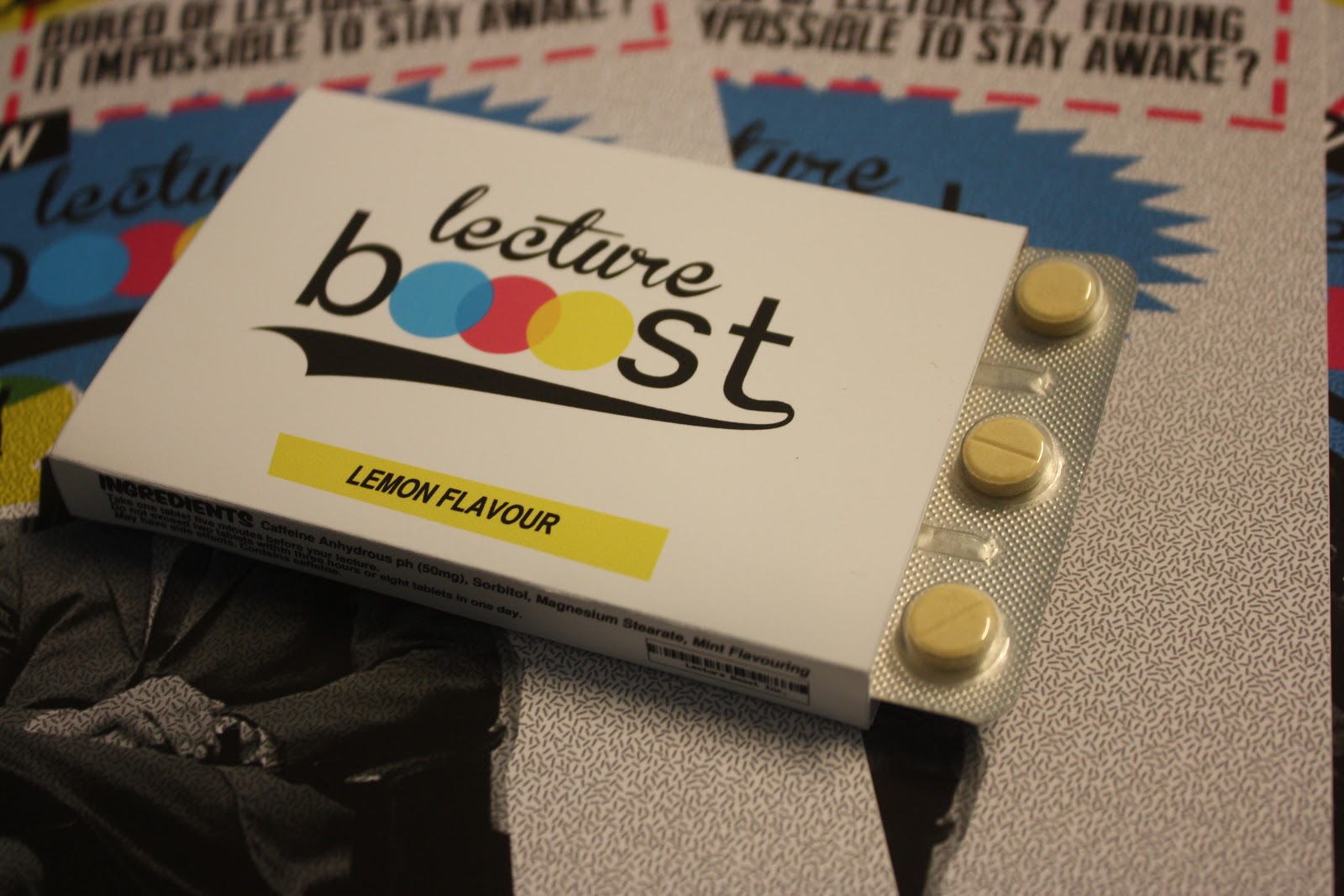
First we looked at the box, we wanted to make it typical of a medical product. But we didn't want to make it too clinical and boring. We looked at different dimensions and types of packaging. In the end we took inspiration from the Trident chewing gum packaging.


Here are the prototypes of the packages, we took into consideration the ergonomics of the boxes, they easily fit in the hand and are thin enough to slip in to your pocket. They are big enough that we can relay all the information that we need to on to the packaging.

This is the net of the product. Its colourful and bright. The professor figure on the back adds humour and lightens the tone of voice. The packaging is simple and straight forward and relays all the information needed.


Here are the first prototypes including the design.

This is the final poster design.

This is the leaflet design, which incorporates all of the elements of the product together.
Group Crits 27/09- Prepare
- Present
- Listen
- Clarify
- Reflect
- Evaluate
- Feedback - Opinions, Audience, Suggestions
- Discuss
Main points of feedback:
- Limit purchase of lecture boost so there is control//no overdosing
- Black doesn't make sense as mint flavouring
- Include nutritional information//ingredients >> makes the product more legitimate
From this we decided straight away to eliminate the fourth//black flavour, and instead of having blue as blueberry make the blue mint flavour. We also added extra information to the packaging about dosage and ingredients etc. me and suzy cichy researched ingredients of standard energy tablets as well as side effects and dosage.


We added the information to the sides of the packaging:

Next we planned out our presentation. As a group we all provided information for a powerpoint presentation. We all broke the presentation up, and presented certain parts. The feedback from everybody including Amber was that we worked really well as a group and seemed united.
Here is a selection of the slides:


We kept the presentation clean and simple. It is to the point and stylish. We also had flyers posters and packaging as handouts for people to look at while we did the presentation. Over all i think we all worked really well as a group. See PPP for final evaluation
Final design (photography by me)