Colour Experiments
Our Task:- Using the principles, processes and resources introduced in the module so far produce a set of 10 studies that explore the theories and principles of colour. You should aim to explore the 7 colour contrasts introduce in Colour Lecture 3 - Colour & Contrasts and demonstrate and applied understanding of the relative nature of subjective colour.
Each study/experiment should consist of 10 individual images that demonstrate how our perceptions of colour change based on it's relationship to other colours. You should aim to explore different aspects of colour theory through a range of different approaches an methods.
Mine and vicky's power point presentation-

Our first experiment (that we used for presentation)


 This is a purple pad against a neutral background.The contrast of colour isn’t high because of the neutral background.This has the highest contrast of complete colours.The mix of the colours would not be appropriate for typeThe yellow looks almost green on this image because the purple is warmer it brings out the cold in the yellow which is contrast of temperatures.

 Next we picked a wash bag and placed it with the purple book on top of the previous card.We did this because the yellow has a higher contrast of hueThe purple has a higher contrast of temperature against the soap bag.As well as higher contrast of complimentary colour.


Next we picked a kitchen utensil we placed yellow card.The contrast of temperature Is closer to a blue hue than a red. The complimentary contrast isn't as great. Here we placed both objects on the yellow card there a number of different colour contrasts taking place here.The contrast of temperature is greater with the note book compared to the kitchen utensil. By the contrast of extension , because there's not a proportional scale of each colour against the yellow background. The notebook appears more purple than the utensil.


 Because of the brightness of the orange highlighter i feel as thought the saturation is just as great with both different backgrounds but brighter on the complimentary blue.

 Although red and green aren't that far apart on the colour wheel the saturation is great.


Mine and vicky's power point presentation-

Our first experiment (that we used for presentation)
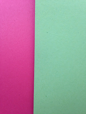
COMPLEMENTARY contrast - formed by juxtaposing complementary colours from a colour wheel or perceptual opposites.

We have chosen Purple & Yellow for our experiment because they are complimentary colours, they are on opposite ends of the colour wheel.

COLOUR EXPERIMENTS
1 COMPLIMENTARY COLOURS:-


Next we picked a kitchen utensil we placed yellow card.The contrast of temperature Is closer to a blue hue than a red. The complimentary contrast isn't as great. Here we placed both objects on the yellow card there a number of different colour contrasts taking place here.The contrast of temperature is greater with the note book compared to the kitchen utensil. By the contrast of extension , because there's not a proportional scale of each colour against the yellow background. The notebook appears more purple than the utensil.
2 CONTRAST OF SATURATION WITH COMPLIMENTARY COLOURS-
Opposites on the colour wheel are the extremes against each other. De-saturating complimentary colours does not affect this extreme contrast but makes it worse. This is because the strength of the colour is lacking and recedes into the background.


Theres more saturation against the complimentry colours rather than the neutral. The sponge appears brighter against the purple background. Where as the sponge on the neutral background becomes duller.


The same happens here with the purple pad against the neutral background it becomes duller. Where as the pad against the green background makes the saturation greater because purple and green are far apart on the colour wheel but not as far apart as the purple and yellow.


The saturation is greater on the red phone case against on the blue background making it appear orange where as when the phone case is on the neutral background it appears a dull red.
3 CONTRAST OF TONE -
Formed by the juxtaposition of light and dark values. This could be monochromatic - the rods in your eyes differentiate tone. The extremes are black and white, they have the higher contrast.


 Theres a greater contrast of tone on the yellow background as purple is closest to blue on the colour wheel. As it is a tertiary colour and is mid way between red and blue theres also not a great contrast on the red background.
 I chose a red phone case on top of a blue piece of paper I feel these colours both have strong tone but red being the strongest tone creating contrast.

 Both of these colours have high tone the red is the brightest and creates the contrast.
 The blue box is a lot darker than the light blue card , there is a high tonal contrast because the blues are so different in tone.
 The tone of the bright yellow against the brown is brighter as the brown is dull and lacks tone its also the darker of the two colours.

Where as the deep purple still has the strongest tone but is the darker colour.

 These two items have a similar level of saturation the pad appears more bright here because there closer in colour so the saturation is less visible.

 Because the background is darker than the posit notes , they become more saturated. Although the post it notes are bright when there by them selves they become even brighter on top of a low saturated coloured background.
 The green on the lip balm is really pale it has a lower saturation than the green background. The brighter the background is the lower saturation the object has.


 The background is darker than the string, it become more saturated. Although the string is bright when its by them selves its become even brighter on top of a low saturated coloured background.


 These items both have a low saturation because they have similar tone.

 These two items have a similar level of saturation the nail varnish appears more bright here because there closer in colour so the saturation is less visible.

 Because the background is darker than sewing kit ,it becomes more saturated. Although the sewing kit is darker when its by itself it becomes even darker deeper blue on top of a low saturated coloured background.
 These two items have a similar level of saturation the deodorant lid appears more bright here because there closer in colour so the saturation is less visible.


 I would say this colour balances because the orange is a lot brighter and stronger toned than the lighter blue.
 The colour is unbalanced here because there is to much orange in comparison to the blue. Its seems a lot more unbalanced than the first experiment when theres just under less the orange amount.

 These colours are balanced out the higher proportion of green against the red balances it out.
 The colour is unbalanced here because of the amount of tone there is in the red there is to much in comparison to the green.


 The mascara appears warmer in colour as the red brings out the warmer tones. The same as the last experiment.
 There is a low contrast between these two objects because red is a warm colour. These colours are both very similar and there isn't much contrast.
 Here again there is a low contrast between both objects because of the brightness of the phone case adds to the temperature of the background.
 The yellow posit notes made the red background increase in temperature and the yellow became cooler making a high colour contrast.
 The same thing happened with this box as it did with the yellow posit notes the blue made the red background increase in temperature and the blue became cooler this made a colour contrast but not as high as the experiment before because the blue is darker.
 The purple object becomes cooler in comparison to the warm background creating a contrast.


8 CONTRAST OF HUE -
One way to create a powerful contrast is to place two intense hues side by side. Use pure bright colors and see the stark contrast.the greater the distance between hue's on the colour wheel the greater the contrast.
 Because orange and blue are further away on the colour wheel these two bright colours create a high contrast of hue.
 There is a slight contrast of hues because the high lighter is so bright but the because the colours are so close together theres not much contrast.
 There is a greater contrast that the image above because the colours aren't the same but still little contrast as orange is next to yellow on the colour wheel.
 There is a a greater contrast of hue here because the green string. and red are far apart on the colour wheel.
 The same with these green posits notes , but there is higher hue because the green is brighter than the string.


 The darker blue background makes the lid appear lighter when its actually a brighter blue. As these colours are too similar theres very little hue created.


Because purple and blue are next to each other on the colour wheel no hue is created between these objects.

The post it notes are brighter than the background but because there similar in colour the contrast of hue is really low.
Formed by the juxtaposition of light and dark values. This could be monochromatic - the rods in your eyes differentiate tone. The extremes are black and white, they have the higher contrast.


I placed a purple object on the top of 3 primary colours to see how strong the tones were, yellow is the lightest tone , red is mid tone and blue is the darkest tone.


The blue has a high tonal contrast next to the neutral background as the neutral lacks tonal value.


Where as the deep purple still has the strongest tone but is the darker colour.
4 CONTRAST OF SATURATION:-
Formed by the juxtaposition of of light and dark values and there relative saturations. a de-saturated is a light/pale colour. when put next to a colour which is more saturated colour is placed next to it this new colour is the strongest. this comparison between these colours helps you perceive the strongest.

The brighter the background item is the less saturated the sponge becomes. So in this case the background isn't that bright so the sponge is clearly visible although the sponge appears bright when its by its self when its on top of something as bright the sponge becomes less bright.


This is the greastest range of saturation out off all three.


These two items have a similar level of saturation the string appears more bright here because there closer in colour so the saturation is less visible.

The phone case and the red background have a similar level of saturation the phone case appears more bright here because there closer in colour so the saturation is less visible.


This is the greatest saturation out of all three.
5 CONTRAST OF SATURATION:-

The background is less saturated than the pad. So it makes the pad appear more saturated and a deeper purple colour.


The background here has the highest saturation than the object on top making the object look less bright.


The background is less saturated than the high lighter. So it makes the highlighter appear more saturated and a brighter orange colour.


This is the greatest saturation out of all three.
6 CONTRAST OF EXTENSION -

You need less yellow to make the colour balance. because yellow is the lighter colour in comparison to the purple so in this case the colour is unbalanced.

There is a lot of yellow used here so this experiment is even more unbalanced than the pad and the notebook.

These colours are balanced. The higher proportion of purple against the bright yellow balances out.


This balances because the orange highlighter is so bright it balances the amount of blue that is used for the background.


I think that the red in this experiment still overpowers the green as its that bright making it unbalanced.
7 CONTRAST OF TEMPERATURE -
Temperature is an attribute of color or a characteristic of a pigment. In the context of color and painting, temperature is the degree of warmth or coolness measured when one color stands in relationship to anothercolor creating a measure of contrast. This perceived temperature is usually measuredrelative to something else or relative to the area around it.
For this experiment we chose to place our object on a warm colour background and a cool colour background and compare the differences.

The purple pad appears cooler in colour against the blue background as it brings out the blue tones with in the purple pad.

Here the pad appears warmer in colour as the orange brings out the warmer tones. Because purple is a secondary colour it has both blue and red tones, therefore has a wide contrast of temperature when placed against different colours.


Both the pen and highlighter give of warmth like the red but because they're lighter and slightly cooler they create a higher contrast.
One way to create a powerful contrast is to place two intense hues side by side. Use pure bright colors and see the stark contrast.the greater the distance between hue's on the colour wheel the greater the contrast.


Although the yellow and red aren't that far apart on the colour wheel there is still greater hue in this experiment.


These to experiments create the greatest hue as they are complimentary colours and are the furtherst apart on the colour wheel.
9 CONTRAST OF HUE -

Theres little hue created in this experiment due to the fact the colours are next to each other on the colour wheel.


Although the colours are the same because the box is so dark it creates more hue than the last experiment.

Theres hue created here because both of colours are really bright but as there simlar theres not much contrast.


