Wednesday 27 February 2013

OUGD404 Design Principles: Construction of Grids


Before you can apply a grid you must understand the requirement of the grid for the work to be produced.
Typeface text & illustration print method and paper quality must be confirmed before hand.

Always start with sketches - thumbnail sketches will make your job of finally layouts easier and productive.

Thumbnail sizes should be proportonate to the final format.
Before drawing your sketches consider the number of columns needed-
1 column only for text and illustration gives you little freedom of layout.Restriction of making illustration small, medium or large.

2 columns, logically gives you scope: 1 column for text 1 column for illustration that can be mixed together.

2 column division can be sub dived to create a 4 column page.

Disadvantages of 6 column systems are:
lines of txt will be narrow small typeface has to be used. however this solely rests on the function that is to be preformed.

For statistics , Figures , graphs & trend line publications: Use 4 columns per page.

The width of a column dictates the size of typeface used. The rule: The narrower a column is the smaller the typeface. why is that?
  • Make a variety of thumbnails and layouts/designs
  • Do not rely on just one set of thumbnails
  • Englarge a small selection of appropriate thumbnails
  • Compare select and repeat the process until you are confident with the design.
APPLY TYPE TO COLUMNS
  • The first line must fit flush to the top limit of the column grid.
  • The lsat line must stand on the bottom limit
  • Keep calm it is difficult to find the final solution the first time around.
  • It could mean that your grid field is too hight or too low.

TYPE & PICTURE

A4 format

8 & 20 grid fields , 8 grid fields are used frequently for advertising material and brochures.
If using 8 field grids you can subdivide into 16 grid field

8 grid fields allow various sizes of illustration to be portrayed. You can use with or without text. You need to have a good perception of composition.

Creating our own
We first made an a4 page spread and made the measurements 15mm  25mm  for the margins and 2 columns.

To create guides we went to layout create guides. we can select how many rows and columbs we want.
To create the a grid the easiest way is to create grids is to grab a rectangle frame tool and using the up arrow and the right arrow to create guides across and up.

Making guides with a ruler and pulling it to the top and bottom helps create symmetry if you click on the bottom ruler guide and then clicking on the Y axis you then put ' /2' which splits the page width and puts you a guide right in the centre.


Another way to make a grid is to go to window>utilities>scripts and click on apple script this gives you an option to make grid.

Tuesday 26 February 2013

OUGD404 Design Principles: Grids and divine proportions

Grids and Divine Proportions.

Before you can apply a grid you must understand what the requirements of the work to be produced. typeface text and illustration print method and paper quality must be conformed beforehand.
thumbnail sketches will make your job of layouts easier and productive. thumbnail sizes should be proportionate to the final design.

Before drawing your sketches consider the number of columns needed. for example, 1 column only for text and illustration gives you a little freedom of layout. 2 columns logically gives you more scope, 1 column for text one column for illustration. 


disadvantages of 6 column system are: Lines of text will be narrow and a small typeface has to be used. However this solely rests on the function that is to be performed.


For statistics, figures, graphs and trend line publications: use 4 columns per page, you can then play with type sizes and position of images, you can also divide columns in to 8, 16 and so on.


Thumbnails and developments in a nut shell.


  • make a variety of thumbnails of design/layout
  • do  not rely on just on one set of thumbnails
  • enlarge a small selection of appropriate thumbnailsby 1:1
  • Compare them and select and repeat process until you are confident with the design


Apply type to columns.


  • The first line must fit flush to the top limit of the column grid.
  • The last line must stand on the bottom limit.
  • Keep calm it is difficult to find the final solution the first time round.
  • It could mean that your grid field is too high or too low.


DIVIDING THE PAGE-


*Fibonacci sequence ratio 8:13 links to Golden section
1.62 is the golden number 1.62 will never change and get bigger or smaller
Is also know as the Golden Rectangle
Definition - "Golden Rectangle is a rectangle which the ratio of the length to the width is the golden ratio"


Rules of thirds
The concept of the golden ratio can be simplified. The rule of thirds covers the placement of points of interest in a scene. Divide any given image into thirds both horizontialy and vertically. You'll get 9 grids. 


Thursday 21 February 2013

OUGD406 Screen Printing Workshop: CMYK


SCREEN PRINTING PROCESS:

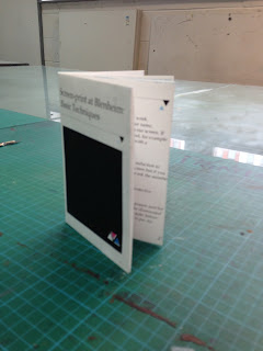
We had a screen printing workshop to make a hot dog book. This book would contain the rules and guides of the screen printing workshop..
we first were to use the colour yellow we mixed the yellow paint and put it on top of the screen , we used news print and printed so see where the print was on the board so we could put masking tape down to make it for the paper.After the first print a yellow square and a tshirt printed onto the paper.
The second colour we used was magenta we put the paper portrait and on the marks that were on the board and repeated the process we were given a layer of pink over our yellow cake and a bird and an apple.
The third colour used was cyan we repeated the same process as the other two colours, we realised tim the cyan colour we had to put more ink down because we were getting a blotchy effect on our paper. The cyan left the dividing lines and the large A & B.
The final colour we used was black this finished off the document we were left with a image in the corner of a cake that was fully filled with different colours and a fully blocked square on the other side.


HOT DOG PUBLICATION:
When our screen print was dry we cut the sides off and scored along the middle we folded the book together to make a hot dog book which folded out to read information.
undefined

OUGD406: Indesign


Wednesday 20 February 2013

OUGD406 Indesign Response: Camel DPS

PROCESS:

I started the process of my design by creating some thumbnail sketches of layout ideas.


This is my favourite layout thumbnail. I think it is simple and effective. Much like the Natural Geographic layouts i researched it is clear and precise. I think this layout will aid the readability of my final design. It is clear and functional.


PHOTOSHOP:


I started the process by editing an image of a camel using photoshop. Because i wanted the spread to have a vintage, collage feel to it i used the polygonal lasso tool to roughly select the outline of the camel.


As camels travel in herds and all look similar i repeated the same image 3 times and used the letters of the world camel to show a visual metaphor of the camels carrying a heavy load.  I also think it adds to the collaged overlapping aesthetic that i researched.


To further the collaged aesthetic I used the arabic translation on top of the camels. I used the 'Darken' layers tool so that it was slightly transparent. As i liked the colour scheme used in the camel image on from my research i decided to make the text red.


INDESIGN:

For the next stage of the process I set up the page layout on indesign creating a facing pages A3 format layout. I adjusted the bleeds and gutter measurements, something i learned how to do from the indesign workshop.


Next i created the grid so i could simply add the text and image to the double page spread.


I decided that adding more text columns to the layout would improve the readability of the information to i doubled the amount from 2 to 4. 


I then copied and pasted the information i had researched in to one of the columns. I clicked on the red cross over flow button seen in the bottom right hand corner and dragged it in to the next column, i repeated this till there was no over flowing text. I then resized all the text so it fitted perfectly in to the text columns.


This is the final design displayed in InDesign. I am really pleased with the outcome. I think i used my layout research effectively to make a double page spread appropriate to the brief.

The stock choice for my final design when printed (see physical hand in) really added to the aesthetic value, i chose antique white which is a rough textured sandy coloured thick paper. It really helped portray the collaged, vintage feel i wanted to create.


It had the same quality and feel of this poster i researched earlier.


FINAL DESIGN:


Tuesday 19 February 2013

OUGD404 Design Principles: Canons & grids


A gridded page is much like scaffolding for a building. It is a structure that elements can be organized. A grid will help continuity to be maintained and information digested with flow.


In our last session we were set the task of creating a custom size page using the techniques we had learnt.

3x6cm

Then we had to apply the Van de Graaf canon technique.


Leading

Leading is the distance between the baselines of successive lines of type. The term originated in the days of hand-typesetting, when thin strips of lead were inserted into the formes to increase the vertical distance between lines of type.

Width of a column
Column width is more than just design or format.
It is also based on legibility.

- Overlong text lines tire the eye, as do over short ones.
- Readers find overlong lines strenuous to read. This is because too much energy is spent keeping the horizontal line in sight over a long distance.
- Too short of a line and your eye changes text lines too often.

Wrong column widths lead to.. time and energy wasted.


Margin Proportions

Margins can have a influence on the overall feel of a page of print.
Too small - looks crowded and too full.
Too large - exageration.
Well balanced margins on the sides, head and tail can create an agreeable impression.


Width of a column -
Column widths with 12 point san serif 14 point leading A column is easy to read if it is wide enough to fit in average 10 words per line.


MARGINS
Margins can have a influence on the overall feel of a page of print


When we had learnt about canons, leading, margins etc... we were set the task of sketching some single page layouts with different margin sizes.